Flash MX 2004 MP3 Player Pg.4
source: http://www.thegoldenmean.com/
4 — Appearance
The Visual Assets
This paragraph should be replaced by a Flash movie if you have at least version 7 of the Flash Player and your browser has Javascript enabled.
The time has come to finally make something you can see! The visual aspects to our Player fall into three major categories:
- decoration
- Information
- Controls (User Interface)
A note about dimensions:
The ActionScript we will develop shortly is designed to accomodate graphics of nearly any dimensions. Things like progress bars and info text fields don’t need to be a specific length. Therefore in describing the creation of the visual elements I have intentionally avoided recommending dimensions. You should feel free make it what you want it to be. About the only real limitation is how small you can make UI elements like buttons while still permitting a user to figure out their purpose and interact with them.
Decoration
This category includes the Player’s background, stuff I call “branding” (your band’s name for instance) and any other doo-dads that are exclusively visual.
 A background is a good place to start. Give it some thought because it defines the size of the player and has to work with your UI elements. It can obviously be as simple or as elaborate as you choose. Do whatever you feel works with the existing design of your site. Even if you create the background directly on the first frame of your background layer, save it as a movieclip symbol because it will get used again later for the setup clip. The simplist way to turn a graphic into a movieclip is to select it (double click to select both fill and stroke) and press F8. Give the symbol a name (I suggest “background_mc”) and it shows up in your library. Neat and easy.
Information
The Player gives two forms of feedback (I suppose three if you count the music that comes out of it, but that’s not part of this tutorial). There is the scrolling text field that gives information about the track that is playing, and there is the visual indication of download status and position in the track. The latter crosses over into Controls category, but I’m going to discuss it in this category.
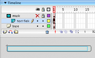 The info text window is composed of three elements contained on separate layers: the background (not strictly necessary if you don’t want, but I think it helps make the text more readable), a dynamic text field and a mask layer. (The info text could very well extend beyond the info window and if it does it will scroll. We need to mask out all but the area inside the window.)
Assuming you are going to use a background for your info text, here is a reasonably efficient way to make the info text module. Click frame 8 of the info text layer on the main timeline and press F6 to create a keyframe. Using the rectangle tool, draw a filled and stroked rectangle to dimensions that fit your available space. (You can add a radius to the rectrangle tool to give your rectangle rounded corners.) Switch to the arrow tool and double click the rectangle to select both the fill and the stroke. Press F8 to make this graphic a new movieclip symbol. In the dialog that appears, name the symbol “info_mc”.
Locate “info_mc” in your library and double click it to edit the symbol. Create two new layers. Name the middle one “text” and name the top one “mask”. In the layer named “text” use the text tool to drag out a new text field. Don’t worry about its length, but you might want to define the text attributes (such as font, color and size) for that text field. Be sure to give the text field an instance a name in the inspector palette. I named mine “info_txt”. (We will be referring to this text field with ActionScript and in order to do that the text field must be given an instance name.) Now click once on the fill of the background graphic (layer 1) and select copy. Click once on the first frame of the “mask” layer and select “paste in place”. This is a very easy way to insure perfect registration. Right click (or control click for Macs) and select mask from the contextual menu. Now any text overflow will be concealed.
Now to the progress bars. In previous tutorials the download progress and the playing position were indicated numerically. The code to animate the progress bars is very similar - you will probably recognize it as an old friend. Besides being somewhat more aesthetically pleasing and economical in terms of space, the progress bar is going to permit an exciting development - we will be able to drag the position bar to move around within the playing track.
Building the load status module requires a little thought. We need to make a movieclip symbol for the download bar, and another for the position bar. Then we need to make a second module that combines both bars in one movieclip symbol. A final movieclip symbol is made that adds a background and mask in much the same way we did with the info text module.
![]() Create a new movieclip symbol (press command (Mac)/control (PC) plus F8) and name the new symbol “dBar_mc”. Select the rectangle tool and choose the fill color of your choice and no stroke. Drag out a rectangle that is fairly long and not too tall. As stated before, dimensions don’t really matter, but I made mine 200 pixels long because it looked good. The only really important thing is that the right edge must be touching the registration point (the registration point looks like a plus sign in the illustration here). Normally when I make a shape I make its left edge touch the registration point, but we are going to animate this shape by incrementing its _x property. It will start at zero downloaded and no bar showing, moving to the right as data downloads. That is why the bar needs to have its right edge align with the registration point, which represents zero.
Create a new movieclip symbol (press command (Mac)/control (PC) plus F8) and name the new symbol “dBar_mc”. Select the rectangle tool and choose the fill color of your choice and no stroke. Drag out a rectangle that is fairly long and not too tall. As stated before, dimensions don’t really matter, but I made mine 200 pixels long because it looked good. The only really important thing is that the right edge must be touching the registration point (the registration point looks like a plus sign in the illustration here). Normally when I make a shape I make its left edge touch the registration point, but we are going to animate this shape by incrementing its _x property. It will start at zero downloaded and no bar showing, moving to the right as data downloads. That is why the bar needs to have its right edge align with the registration point, which represents zero.
![]() The other item we indicate with a progress bar is the position - how far into the track we are. The process for creating this bar is identical to that described above (note that even though how long the bar is doesn’t matter, it does need to be exactly the same width as the download bar). Name the new symbol “pBar_mc”. Make it a different color than the download bar so you see one overlap the other. And I recommend making some sort of arrow or something so the user gets a clue that they can drag it! Otherwise they will likely assume this is just like so many other progress bars they have seen in countless Flash movies, missing its interactive aspect.
The other item we indicate with a progress bar is the position - how far into the track we are. The process for creating this bar is identical to that described above (note that even though how long the bar is doesn’t matter, it does need to be exactly the same width as the download bar). Name the new symbol “pBar_mc”. Make it a different color than the download bar so you see one overlap the other. And I recommend making some sort of arrow or something so the user gets a clue that they can drag it! Otherwise they will likely assume this is just like so many other progress bars they have seen in countless Flash movies, missing its interactive aspect.
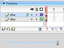 Once these two symbols have been made, we combine them into one unit. Create a new movieclip symbol (“bars_mc”). Create a second layer in this new symbol. Drag an instance of the download bar into frame 1 of the bottom layer and give the instance a name: “dBar_mc”. Drag an instance of the position bar into frame 1 of the top layer and give it an instance name: “pBar_mc”. It is very important to name the instances so ActionScript can talk to them. Also - be sure that the registration points of both progress bar instances match the registration point of the new movie.
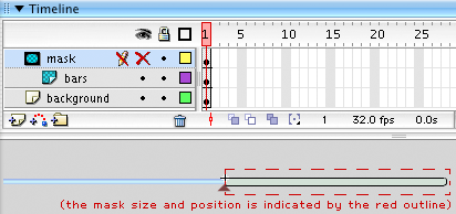 The final step is to create one final new movieclip symbol (“loadStatus_mc”). This will be constructed nearly the same way we made the info_mc symbol. Create two new layers for a total of three. In the bottom layer draw a filled and stroked rectangle to serve as a background. It should be the same width and height as the two bars, and its fill should be something different than what you used for the two bars so it is obvious it is getting covered up. Note that this rectangle should have its left edge aligned with the registration point.
Click the first frame of the middle layer and drag an instance of bars_mc onto the stage. Give the instance a name: “bars_mc” will do. Align bars_mc’s registration point with the registration point of the new movieclip symbol. (The bars should now extend off to the left, the background off to the right.) Finish this module by creating a mask that will reveal the background and hide the bars. We don’t want to see them until they have started moving to the right.
User Interface
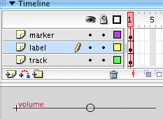 This includes the volume slider, the buttons and the home-made radio buttons. The volume slider is identical to that described in previous tutorials so I’ll avoid going into depth. A movieclip (“marker_mc”) is made to represent the bit that slides. A new movieclip is made (“volume_mc”) consisting of two layers. In the bottom layer draw a straight line with the line tool, starting at the registration point and extending some distance to the right. I made mine the same length as the progress bars (200 pixels) because it looked good. In the second layer place an instance of marker_mc. Be sure to name the instance.
Buttons are a little trickier but not much. A button will have a symbol that indicates its purpose and a button will have two states which you might think of as on/off or active/inactive or lit/unlit. I will examine the construction of one: the rest are identical except for the symbol.
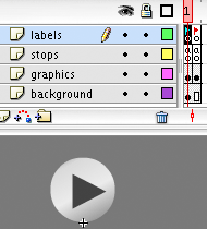 Here is the play button (“play_mc”) in its off/inactive/unlit state, the state the button will be in when nothing is playing. Note the construction of the layers and frames. Recall that layers keep assets organized while frames define states. Start by making three new layers but keep them all at one frame for now.
To make things consistent I made a movieclip symbol for the background (“buttonBase_mc”) so that all my buttons will look exactly the same. That goes on the bottom layer. The second layer from the bottom holds the symbol that is unique to each button. It is okay to draw this shape directly - you don’t need to reuse this. Make it something like gray that suggests it is off or inactive.
The second layer down from the top holds code, but very simple code. All we want to make sure of is that the movie doesn’s start looping. Click once in frame one of this layer, open the ActionScript editor and type
stop();
Press F6 to make a new keyframe and enter the identical code.
The top layer holds labels. Click in the first frame and enter a label in the inspector palette: “unlit”. Press F6 again and add a label to this frame: “lit”.
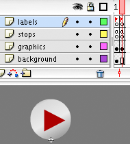 Click the first frame of the bottom layer and press F5 to extend it by one frame (but not a keyframe). Now the background will remain the same for both states. Finally, click the first frame of the graphic layer. Press F6 to make a new keyframe. Select the graphic in the second frame and change its color. I like red but you do what you want. Something that tells the user that the button is active.
All the other buttons are made the same way, including the home-made radio buttons.
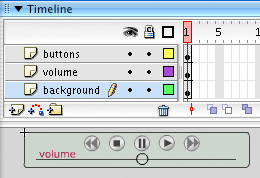 Now to keep all these UI elements tidy, to avoid having five buttons and a volume slider rattling around the main timeline I put them all into a main controls module movieclip (“controls_mc”). Be sure to give each item in the control module an instance name because we will be referring to all of them with ActionScript very soon.
 The final visual element, “setup_mc”, is optional. I feel strongly that a visitor to my site should control whether their computer makes sounds or not. It is also helpful for them to inform the player as to whether they have a fast or slow connection. I decided that one panel could accomplish both things. The default behavior of the Player as provided in the project files is to attach a setup panel and pause there, waiting for user input. After receiving “permission” from the visitor to play, the movie proceeds to the frame that loads the play list. If you opt not to buid in what I call a “courtesy pause” it’s easily defeated in the ActionScript.
I won’t go into too much detail about building the setup panel because it uses the same background, radio buttons and play button we have already built for the Player itself.
We now have all the PHP code and visual elements the project requires. The rest of the Player is ActionScript. Page five begins the coding by introducing XPath.
--top--