cut it out
source: http://www.thegoldenmean.com
Why Crop?
originally written for the GurusNetwork.com
![]() n spite of a photographer’s best efforts to frame and compose a photograph carefully and deliberately, many images can benefit enormously from thoughtful reconsideration after they have been captured. A little emotional distance from the excitement of whatever caused you to release the shutter can provide valuable objectivity. Maybe things moved too fast to compose carefully enough; maybe you didn’t have the optimum lens with you; maybe an obstruction prevented you from standing where you would have preferred; maybe the fixed aspect ratio of the film or sensor isn’t ideal for a given image. Whatever the reasons, the message which a photo conveys can often be strengthened dramatically by thoughtful cropping.
n spite of a photographer’s best efforts to frame and compose a photograph carefully and deliberately, many images can benefit enormously from thoughtful reconsideration after they have been captured. A little emotional distance from the excitement of whatever caused you to release the shutter can provide valuable objectivity. Maybe things moved too fast to compose carefully enough; maybe you didn’t have the optimum lens with you; maybe an obstruction prevented you from standing where you would have preferred; maybe the fixed aspect ratio of the film or sensor isn’t ideal for a given image. Whatever the reasons, the message which a photo conveys can often be strengthened dramatically by thoughtful cropping.
To Crop or Not To Crop…
The renowned French photojournalist Henri Cartier–Bresson is credited with coining the phrase “the decisive moment”. This concept makes reference to the almost miraculous confluence of tone, shapes, gesture and framing that comprise a powerful, effective photograph. The school of thought that arose from this concept believes that, at the instant the shutter opens, you either have “it” or you don’t. Cropping after the fact can’t fix it if you failed to capture “the decisive moment”. Purists of this school will go so far as to print their images with the black film border showing, to prove that no manipulation to framing was done.
If you subscribe to this philosophy, you need read no further. If you are not ready for that level of artistic discipline and wish to learn some of the fine points of Photoshop’s wonderful cropping options, then by all means read on!
What Can Radical Cropping Accomplish?
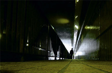
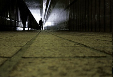
 Here is the wonderful image that provoked me to write this tutorial. The image, Tokyo Tunnel, is provided courtesy of a sensitive and accomplished artist named Katsuyoshi Ueno. As you can see, the original image is very strong — making powerful use of a very low angle, dramatic lighting and diagonal lines that converge strongly on the focal point. This is very creative “seeing”, and as it is it’s a very strong image.
When katsu first posted the image on the GurusNetwork’s Photography forum, I knew immediately it was a very appealing image, but drew attention to the fact that the subject matter was placed directly in the middle of the frame. The “conventional wisdom” of composition discourages this as being too static. “Conventional wisdom” is often rigid and superficial, and in fact offers the rigid and superficial “rule of thirds”, which posits that, if you divide an image into thirds vertically and horizontally the most powerful placement of the photo’s subject should be at one of the intersections of thirds.
 Every artist believes that such rules are made to be broken. Still, I wondered what would happen to this particular image if it were cropped in such a way as to disturb its symmetry. Following are three alternative croppings, each of which has some merit, each of which “feels” significantly different and each of which I feel has more energy than the uncropped original.


Putting the “Photo” in Photoshop
 “Old School” photographers (meaning the ones who used chemical rather than electronic capture media) always had cropping “L”s on hand — usually made of black cardboard and shaped like the capital letter “L”. By sliding these around on a Polaroid™ proof print, a contact sheet or a proof print, cropping alternatives could be experimented with very rapidly.
A more sophisticated variant of the black cardboard was the store–bought device that connected the two cropping masks by means of a metal rod. The angle of the rod ensured that the aspect ratio of the rectangular opening remained proportional as you made it larger or smaller. This basic tool of the graphic artist is shown in the photo at left, which is of course the visual symbol which Adobe’s U. I. engineers chose when they developed the tool’s icon.![]()
Playing With Crop
To give you a sense of how many different pictures are lurking inside any given image just waiting to be released, I have provided an interactive version of the cropping “L” tool. Slide the masking boundaries around and see how many valid crops you can come up with for each sample image. As you experiment, think about what makes one crop stronger than another, and whether the cropped version is any more powerful than the uncropped original image in each case.
[I know it is human nature to fiddle briefly with a “toy” like this and then move on. I would urge you to invest some real time and concentration with these images, seeing instead of looking. It will pay off.]
--top--