displace
source: http://www.thegoldenmean.com
Displace Filter, Page 7 - Suggesting Volume
or — “Better Bulges”!
I haven’t run across very many tutorials for making something look like it is bulging. The safest, fastest, easiest, most comfortable way is Spherize (hey — quick tip — spherize set to negative values is Pinch, Pinch set to negative values is Spherize. Pretty handy). Of course, not everything is round, and not everything responds equally well to spherize. Displace can offer an alternative.
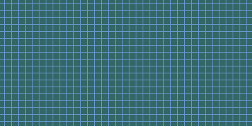
I wanted to give the sense that something like fabric had been draped over a raised shape underneath it. To make the illustration more clear I made a grid pattern to be the “fabric”. It’s not real interesting as a work of art, but it illustrates the point well for this tutorial. In the process of preparing this illustration I learned several helpful things. The first has to do with the interaction of vertical lines in the base image as they relate to vertical lines in the “lump”. You will note that I rotated the Gurus logo - it kept looking ugly as the strong verticals in the logo didn't displace the grid in a pleasing way. Rotation helped a lot.

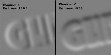
The other tip I picked up makes sense in hindsight but it took me a while to figure it out. The fabric drapes softly over the shape with no hard edges. I kept trying to trim the edges of the DMap and it wasn’t looking right. After I allowed the DMap to stay fuzzy on the edges the illusion worked much better. Below is a cropped version of the A and B channels of the DMap. I made the DMap by duplicating the logo to a new multichannel file, blurring this (Gaussian, 6 in this case), duplicating the channel (remember — we want two channels for maximum control) and then embossing each channel at a different angle (indicated below). Filter>Stylize>Emboss. Why emboss? One of the peculiarities of the emboss filter which makes it so useful for DMaps is that it turns everything that doesn’t have edges (the perimeter of the graphic in this case) that magic 50% gray that causes no displacement. It also localizes the effect most strongly at the edges, and provides some ”direction„ for the movement. Save this as a .PSD file with a name you will remember, and return to the main Image file.
In order to suggest volume, you need more than just the distortion - you need lighting suggestions, highlight and shadow. In this case, I started by duplicating the Gurus logo, blurring and embossing (-45°, 3 pixels); I could have loaded the channel and trimmed by filling with 50% gray. But in this case, trimmed to a sharp edge isn’t what we want — you’ll see why. What I have now is sort of useless looking, but it has the lighting clues. If you select this channel, paste it as a layer and set it to Overlay, the gray drops out and the black and white pop the depth.

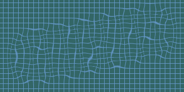
Running the Displace filter from a rather low contrast DMap isn’t very impressive by itself, but you can start to see the advantage of the soft edged DMap — the effect begins outside the shape, just as would really happen if you draped a cloth over a shape. Note that simply adding the Overlay layer helps a good deal in defining the shape.

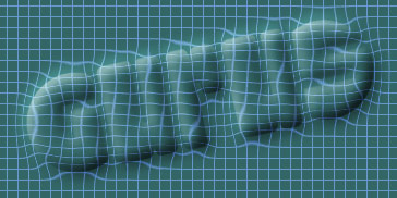
Final touches brought it to life. I made highlight and shadow layers, this time trimmed sharp and set to screen and multiply respectively. So the combination of a soft edged DMap with soft and hard edged lighting clues gives a pretty convincing sense of relief. It’s not real easy to read, is it? But it could be just the ticket for an illustration. It’s sort of mysterious — it hints at what’s underneath. Take this idea, make it your own, apply it to something more interesting than a simple grid and create something stunning!
A Disturbance in Flatland
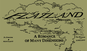
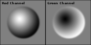
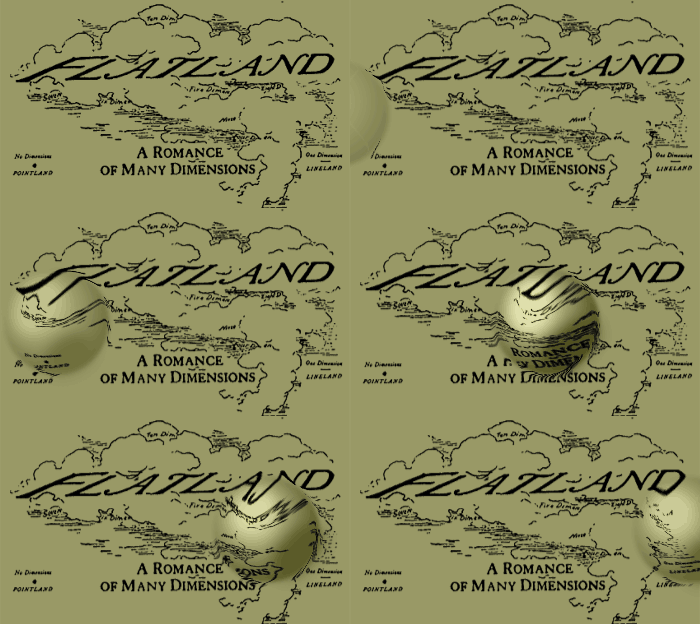
Displace isn’t just for stationary images — it works for animations too! Think about it — if you apply a DMap to a sequence of frames and merge them into an animated GIF… get the picture? How many of you remember “Flatland” from geometry class? This was the two dimensional world described by turn of the century author Edwin A. Abbott (whose pen name was “A Square”). Everyone and everything in Flatland is a two dimensional shape, but everyone and everything looks like a straight line to a Flatlander, who can only see edges! Anyway, I got the giggles thinking about a ripple running through Flatland and came up with this illustration. We start with the Image file, which is the front piece to Abbott's book. Then look at and consider the DMap. Finally, view the animation.
Some notes. I began with a larger canvas than I ultimately ended up with so that the Displacement could start and end at the edges of the field of view. I duplicated the map layer into a new file (so the dimensions would match exactly). I filled the red channel with 50% gray, created a circular selection, feathered it 2 pixels, and applied a radial gradient, white to black, a little off center. I copied this channel to the clipboard, pasted it into the green channel and inverted. That was the basic DMap (remember — Blue doesn’t matter). Back in the Image file, I copied the Background layer 6 times, so I had a total of 7 identical layers. Back at the DMap, I applied Filter>Other>Offset at 70 pixels to the right, no pixels up or down, wrap around; I saved as DMap2, and repeated until I had six DMaps, each with the “bulge” a step further to the right.
Starting with the first layer above the background, I applied the first DMap. In sequence, I applied the rest of the DMaps to the rest of the layers. To achieve some more depth, I copied the red channel from each DMap and pasted it above the corresponding layer. I set this pasted layer to Overlay, varied the opacity from about 40% to about 50% (brighter in the middle layers, dimmer at the beginning and end), and merged each Overlay layer with the corresponding layer below.
Finally, I cropped to the final dimension, opened the file in ImageReady and converted the layers into frames for an animation. Check it out - a ripple in Flatland!
Enough bulges - on to more exciting stuff: Chrome Reflections, Glass Refractions
--top--