displace
source: http://www.thegoldenmean.com
Displace Filter, Page 8 - Glass and Chrome
One of the most frequently requested tips on Photoshop message boards is how to make chrome or glass effects. All sorts of resources exist, but they mostly deal with tweaking the lighting and highlights, and not so much with the distorted reflection or refraction. Let’s address those issues on this page. (By the way, if you came to this page directly without the background of the preceeding 7 pages, you could get lost! Go back and read ’em in order.)
First, let’s consider the primary practical difference between chrome and glass, because the Displace technique for both is very similar. Sorry if this sounds elementary, but a moment of thought will help a lot as you contemplate how to approach your project. Chrome reflects an unseen environment. Does that make sense? What is reflected in the chrome object is outside the frame — behind the viewer (as any photographer knows who has unwittingly captured a self–portrait in a car’s hubcap or bumper!). The classic case uses a landscape: earth tones below and sky tones above with a distinct boundary, the horizon line. The background on which the chrome object sits can be anything — the simpler the better in terms of texture and preferably contrasting in color.
Glass (or clear plastic or crystal or water) on the other hand refracts what you see through it, so what gets distorted is part of the background image. Very similar DMaps can be used to produce very different results keeping in mind the difference between a clear and a shiny thing in terms of what actually gets distorted.
As we saw in the previous page on volumetric distortion, the Displace filter doesn’t make the illusion all by itself — in fact the Displace by itself looks pretty weird. Lighting clues are required to finish the job and make it pop off the background. I warmly recommend the “Photoshop WOW” books for some very detailed and elaborate demonstrations of fine tuning the lighting clues to achieve the gleam chrome and glass requires. I will treat lighting and other finishing finesse topics lightly here; for space reasons my emphasis will be limited to the Displace aspect.
This page demonstrates in turn a chrome object, a glass object, and a whack at a crystal ball.
Chrome
We need
- an object to do the reflecting,
- a background file for it to sit on,
- a file to be reflected, and
- a DMap.
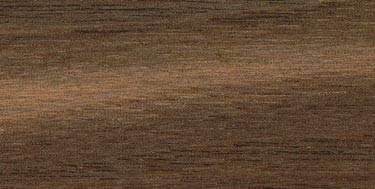
You come up with the shape (try to avoid real fine detail - if it's type, try to stay away from small serif fonts). I’ll reach back to page four and grab the landscape as our reflection source. A simple wood surface will serve for our background. To make things interesting for myself, I made up a client: Opus Editions, a small publishing company who needs a snazzy sign for their headquarters! Here we see the base layer and the alpha channel that holds the logo graphic:

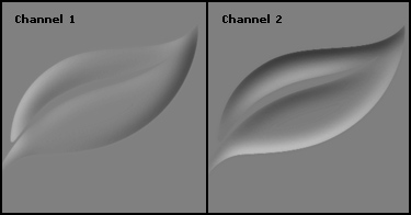
The DMap is generated as before by duplicating the logo alpha channel into a new, multichannel file. This is blurred (gaussian, about 8) and copied to make a new channel You have a channel A and a B now. Channel 1 (or A) controls horizontal movement; Channel 2 (or B) controls vertical. Emboss each as before (the formula that’s working here is 0° for channel 1, 90° for channel 2); load the sharp selection from your image file, inverse selection and trim by filling with the magic 50% gray. Recall that on page 7, “bulges”, we wanted a soft transition at the edges; for this technique we want it crisp, so we trim the mask. We’re going to trim the distortion layer anyway so I suppose you could keep the DMap soft, but I didn’t. Emboss gives a gentle low contrast DMap; feel to turn up the effectiveness with a touch of levels. (A quick note about the advantage of emboss. Besides locating the tonal transitions around the outer edge, accelerating the effect of the displace the way a three dimensional shape would, it provides more “movement” because the opposing tonalities lie on opposite sides of the shape.)
Open the landscape file, size to the same dimensions as the wood base file, copy to the chrome file as a layer and blur slightly (Gaussian, 3). The blur helps with the sense of a reflection. (Remember, the reflection map, the thing reflected, is supposed to be behind the viewer and at some distance.) Note at this point that the choice of reflection source has an enormous bearing on the final outcome: where the horizon falls, color and brightness differences between sky and earth and overall color balance are some of the variables. Since this image is composed predominately of blues, you can expect that to contribute to the metal in a powerful way.
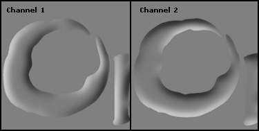

That sets up all the basic pieces: the background, the shape, the reflection source and the DMap. I ran the Displacement filter at a fairly high setting: 75 in this case. Here’s the result:
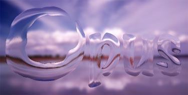
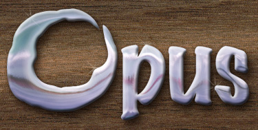
The displacement, while interesting, is far from the whole story. Obviously a lot of work still has to be done to get this thing to a finished state, but this is the critical element, the part that makes the rest believable. Getting the reflection deformation to follow the contours of the image is what Displace can do better that anything else. The steps you choose to take from this point on will be designed to amplify this foundation. (For those of you without benefit of Dayton and Davis’ excellent Photoshop WOW book, I have summarized their very effective technique for adding highlights here.) The reflection needs to be trimmed, highlights and shadows need to be added and color and brightness need to be tweaked. Here is one possible outcome:
Glass
Did you notice how much like glass or crystal or water the first example looked just after the displacement? Let's try applying a similar approach to for a glass effect. Again to make things interesting for myself, I invented another client; I’ll call them “Spring Systems”. Their logo is a stylized leaf. I always think glass tutorials on top of a scenic background look contrived, so I envisioned a glass leaf sitting on top of a piece of paper or something. We start with the background file and the logo shape, stored at this point in an alpha channel. For reasons you will understand soon, the background image must be duplicated to a new layer (and this top layer is blurred slightly — Gaussian, 2).


In steps that should now be familiar, the alpha channel is duplicated to a new file; the channel in the new, multichannel file is blurred, duplicated and embossed in opposing directions as has now become nearly a formula (do feel free to add your own input at any stage of this game!); and the Displacement is applied. Some of you may be wondering why I have avoided the Glass Filter, since it shares so many similarities with Displace. Here it is in action for the first time in this tutorial. There are some notable similarities and differences between the filters. The Glass Filter uses a DMap file just like Displace. Displace allows independent control of vertical and horizontal displacement, tiling smaller DMaps and control of what happens to pixels pushed off the edge. Glass has a sort of preview and some anti–aliasing by way of the “smoothing” slider. Unless you specifically need a feature Displace has, the decision as to which to use is sometimes just a flip of the coin. For variety, we’ll look at this demonstration with the Glass filter. Settings were 12 (amount) and 12 (smoothing).

As with the chrome, we aren’t exactly bowled over with what has just happened. But, as with the chrome, something fundamental is now available to us. Unlike the reflections of chrome, the environment unseen, this has acted on the underlying image on purpose. We start to bring this to life one step at a time. The leaf shape is placed in a transparent layer between the distorted layer and the undistorted background layer; clip the distorted layer to the leaf shape layer by way of a clipping group, and apply some layer effects to the leaf shape layer — something like a soft drop shadow and an inner bevel. The magic of clipping groups is that layer effects applied to the bottom element in a clipping group affect all the other clipped layers above! Below you can see what this has done. (By the way — shadows don’t have to be black and highlights don’t have to be white! In this case, I selected the dark color of the background for the drop shadow color — you can see it best where it overlaps the lettering.)
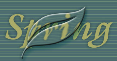
With lighting very similar to what we did above with chrome, here’s a possible conclusion to this project. In preparing the illustration for this tutorial I actually started with the type on a separate layer. To make what has happened more clear, the last image abstracts the glassy part of this image so you can see just that part of it. You can examine the layered version here.

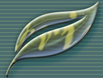
Glass, crystal water - all can have similar light bending properties; try this technique with Dark Garden’s Water Drop tutorial to take it to another level of sophistication! Please note that this technique is geared toward rounded clear shapes. Flat refractors like glass panes or prisms or shards are another thing altogether.
(It’s important that you have a clear vision of what you want to do before you set out to do it. Further reading on the subject of chrome can be found in this article about “Seeing Chrome”; this article does not deal with any techniques but I strongly recommend reading it to get a better understanding of what chrome looks like, so you have a better idea of how to approach it. Another very helpful resource can be found at the Fantasy Art Resource site, particularly a series of articles on reflective and transparent objects that begins with this page.)
Glassy Sphere
This is an altogether different objective than simulating something flat with round edges, and the technique is going to vary accordingly. The more or less standard approach is to sweat over the shading and internal reflections, and then slap on a quick Spherize for the distortion. Because there are a great many online resources for shading a glass sphere, I am going to concentrate on the refraction and leave you pretty much on your own for the shading. We start with a background, blurred (Gaussian, 4) so the ball will stand out in relief. (An unblurred copy is kept for later.) Hovering glass balls are sort of overdone, so I introduce a plausible means for suspension. (I shot the woods in coastal Maine; the hand was shot in the studio with a blue background to make the silhouette easier.)
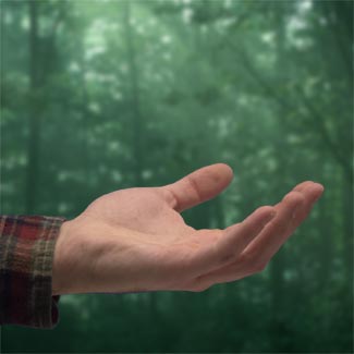
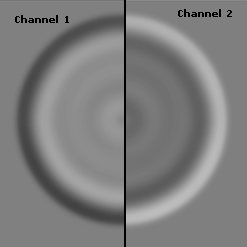
This sets up the proportions for the image, and now I know how big I can make the crystal ball itself. A circular selection is made to fit neatly in the hand, and stored in an alpha channel. This time I did not duplicate the channel for the DMap. Rather, I opened a new multichannel file to the same dimensions as the image file, filled it with 50% gray, loaded the circle channel from the image file (this is especially important since the circle is off center in the image file), feathered approx 6 pixels and filled with black, keeping the selection intact. Now the fun: Select>Modify>Contract 16 pixels twice, and invert. Keep doing this process until you are into the center. Blur the whole file somewhat and you wind up with a series of soft edged concentric layers of gray. Copy this channel and invert. There you have it: A and B. (I was inspired to employ this particular DMap by that most inventive of Displace cowboys, Kai Krause.)
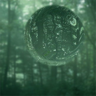
Now for that sharp image of the forest. This technique is the reverse of the glass and chrome, where the displaced layer was blurred. In this case the background is in the distance and the glass ball will act sort of like a lens — bringing the blurry background more into focus and potentially inverting it. So I put that sharp copy I saved above the layer with the hand, and rotated it 180°. Then I ran Displace at 75, 75, stretch and wrap. First we see the Displacement alone, then with the hand (using layer masking to reveal the front fingers and a suggestion of thumb in back). Pretty much beats the pants off Spherize, don’t you agree?
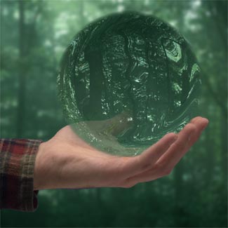
The “lighting” process is one of discovery and finding what looks right. It begins with an edge multiplier and a Color Dodge smudge for a sense of internal reflections and the edge darkening effect of a sphere.
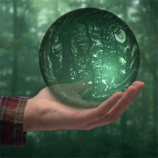
And, fourteen layers later, I come up with something that may not be perfect, but is at least presentable. There is a layer for the broad highlight, a layer for the bright speculars, a multiply layer that darkens the ball near the top, blend modes and opacities adjusted… there is no formula for this. Displace provides the raw material — your eye and intentions take it the rest of the way. If you wish to fiddle with this project, a starter kit is available here. And since this particular image has generated a great deal of interest, I provide some additional material for the interested here.

What an interesting voyage of discovery this page has been for me! I hope it has inspired you to take advantage of the extraordinary potential of the Displace filter. Now on to the conclusion: Extreme Distortions
The amount of e–mail this glass ball thing generated has surprised me. The tutorial was meant to be about the Displace Filter; the example of the glass ball was just that — an example of a practical application of the filter, not a tutorial on making glass balls. Because of that I did, yes, leave out a LOT of steps because that wasn’t the thrust of what I was writing. But that image seems to have struck a chord somewhere.
Because the low resolution demo version that I used in the tutorial worked out so well and relatively painlessly, I later decided to do it over again at high resolution for a post card mailer for my company. Good grief. Creating an image that would pass that level of scrutiny was much harder to do. It took a week to get it to my satisfaction. So I have to be honest when people ask me how I did it — I have to say there’s only so much I can tell you step–by–step And after that your eyes, your judgment and your effort have to finish it.
Still, I guess that maybe seeing where I went might be helpful. Consequently, I have placed low resolution versions of several files on this site. If you are interested in this project you can download a .zip or .sit archive.
You will find the uncompressed folder contains the basic forest image, the layered Photoshop file and a bunch of the DMaps I experimented with. The layered .psd is sort of like a diary. It may not be terribly helpful by itself, but if nothing else it shows the level of complexity a piece like this can require. I don't want you to look at images and think if you just knew what filters to use it would be easy. It isn’t.
By the way — I used Photoshop 5.5 to do this, but subsequent versions haven’t changed anything related to the production of this image.
A note on the DMap: it’s largely trial and error as you will see if you download the files I mentioned above. I started with Kai Krause’s example which you can find at the GurusNetwork archive.
Kai’s demo was low resolution and I had to recreate it in high resolution. So in the process I did a bunch of experimenting. I can’t actually remember which one I used. Look at the DMaps and notice they each have 2 channels. I would start by filling a new canvas with 50% gray, making a circular selection, feathering the selection heavily, filling with white or light gray; deselect and make a smaller selection, feather, fill with black or dark gray and so on — concentric circles filled with alternating gray tones.
Maybe a faster way would be to use the radial gradient tool with a custom gradient. Lots of possibilities.
--top--