displace
source: http://www.thegoldenmean.com
Displace Filter, Introductory Examples
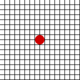 Because the effects of the Displace filter are difficult to visualize, one must approach learning it in a very methodical way. If you are going to learn to use this filter with any degree of control, you must be able to visualize and anticipate what is going to happen. Please endure all this tedious stuff, as it really is fundamental to the fun stuff that I promise is coming. I will demonstrate with a variety of test files as we go along, but for the preliminaries a simple grid with an obvious marker (as shown to the right) will suffice. To keep things manageable in this tutorial, the examples will be very small. Believe me when I say the filter will work on any size file.
But first we have to grapple with an ideosyncrasy — Photoshop marks movement in a different way than we might imagine. Our familiar friend the Cartesian Coordinate System defines the point of origin at the bottom left. Photoshop employs a different system whose point of origin is the top left. (Actually, this is a characteristic of graphics software in general, not just Photoshop, but let’s stay focussed on Photoshop here.) Positive and negative on the X axis is as we expect. Positive and negative on the Y axis are reversed from our expectations:


Important Terminology!!!
If you are new to Photoshop, please pay close attention here. Before this train starts picking up too much momentum, let me take a moment to be painstakingly clear on what I mean by a “channel”, because I’m going to be tossing that term around a LOT in the pages that follow, and because it seems to be a source of confusion for many readers.
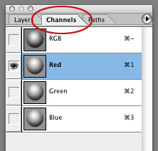 You may be more familiar with or more comfortable with the term “alpha channel”. Every image in Photoshop contains channels. You can examine the channels in an image from the Channels Palette (if it’s not visible, select Window>Channels from the menus at the top of your screen). An RGB image contains a minimum of four channels: the composite RGB channel and one each for Red, Green and Blue. A CMYK image contains a minimum of five channels: the composite CMYK channel and one each for Cyan, Magenta, Yellow and blacK. I say “a minimum”, because Photoshop artists will frequently create additional alpha channels for all sorts of purposes. Just know that an RGB image has at least four, and that’s all that matters for a displacement map (in fact, for a displacement map only the first two - Red and Green in the case of an RGB image - matter at all. We’ll see why in a bit).
In the screen capture shown here you can see the Channels Palette for an RGB image file; note that in this illustration one channel has been selected: the Red channel. This is how you will select a channel to perform some editing action in the pages to come. You should read this as many times as it takes for it to make sense because understanding how to work on specific channels will be critical to using the Displace Filter.
Preliminary examples
Discussion of the interface controls will follow shortly, but first I want you to get a grasp of what this funny filter really does. You know what the test grid started looking like. Below are illustrated the DMap variations and their effect on the Image File (the grid). Please note that for this section the DMap and the Image file are the same dimensions. The significance of this point will make sense later.
Single Channel Displacement Maps and their effect:

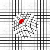

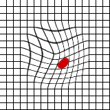
As expected, diagonal movement, up and to left for white DMap, down and to right for black DMap.
Two Channel Displacement Maps with channels indicated:

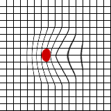


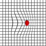


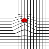

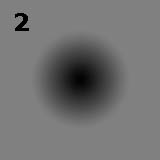

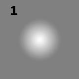

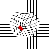

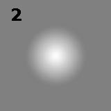
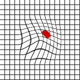
Are you getting a sense of the possibilities? The two missing combinations, white in both channels and black in both channels, would behave the same as the single channel examples above. Please note that when I ran the distortions, I used DMaps made with the multi–channel Photoshop format. RGB and CMYK files will work just fine (if saved in PSD format), but only the first two channels are used — any additional channels are simply ignored. Kai took advantage of this by making a third channel containing an example of the effect for reference. You can suit yourself. I like 2 channel multichannel files.
On to page three: the Interface
--top--