curves, page3
source: http://www.thegoldenmean.com
Introduction to the Curves Command, Page 3
Applying the concepts to improving RGB color photos.
 By now you may thinking I have spent a disproportionate amount of time and words on grayscale images. Since you probably think you work in color how could this apply to you? First, as I stated at the beginning of page 2, the concepts are simpler to present without the issue of color. And second - RGB color images can (and should be) thought of as being comprised of a composite channel and three essentially grayscale channels containing the brightness values of the three colors. If you have never thought of it this way, study this illustration:
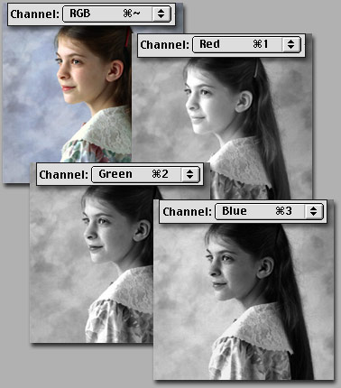
Are you getting an inkling of where this is headed? You can edit each channel with a curve just as we did a grayscale channel, but now in addition to affecting contrast we are affecting the amount of Red, Green and Blue, effectively manipulating color channel by channel. This is the most powerful and precise color correction tool in Photoshop. From this moment on in your career, skip the Color Balance command all together, and save Hue/Saturation and Variations for special effects work. We have something better!
When you invoke the Curves command in an RGB image, the channel displayed at the top of the dialog box defaults to the composite channel: RGB. If your image is okay for color but just needs to be lighter or darker or contrastier, a quick pull of the composite curve will do it, just as with grayscale images. Things get a little more complicated if the color itself needs to be modified. How do you start? Where do you begin? You begin by evaluating the image for a color cast and eliminating it. One of the first big mistakes many people make is to start haphazardly attacking what they percieve to be a color cast in a part of an image with selection tools; in reality, if you can see a color cast in a part of an image, chances are good it has infected the entire image, and should be addressed globally before local tools are brought out. How do you determine if there is a color cast, and what color it is?
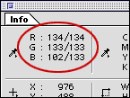
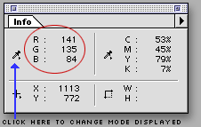 Let me introduce you to our second most helpful tool, the Info Palette. Windows>Info brings this little puppy up, and it should be given a permanent place of honor on your desktop. Run the cursor around your image (doesn’t matter which tool you have selected) and notice that the info palette displays the RGB values for whatever pixel lies under the cursor! Color correction “by the numbers” is the ultimate hallmark of the master color technician, and is way beyond the scope of this introductory piece. But just knowing one fact will make an enormous difference in how you approach color correcting: for a pixel to be neutral, just remember that the values for Red, Green and Blue should be the same. It doesn’t matter what they are, just that they are the same. A light gray will have different values from a dark gray, but if R=G=B you know they will be neutral. (As a sidebar: our eyes and brain are tremendously adaptable; they work together to pull things almost neutral, or almost black, or almost white to what the brain thinks they should be. Colors are okay to evaluate from the monitor, but black, white and especially neutrals should be confirmed with the info palette.)
I can’t tell you what color skin should be, or what values to use for green grass or a navy blue suit. But neutrals are your point of reference. Of course not every image has a neutral in it, but if you start looking, it’s amazing how many photos have something in them that can be used as a neutral reference point. A white shirt; a car tire; a paper on a desk; asphalt paving; a white fence; granite foundations… you get my point. If you need a neutral, chances are better than 50/50 you’ll find something. Now, what can you gather about the color of the pixel being described by the info palette in the previous paragraph? It sure isn’t a neutral! The value of Blue is much lower than Red or Green. What's the opposite of Blue? That’s one pretty yellow pixel. If that was supposed to be neutral, we’ve got to bring blue into line with the others.
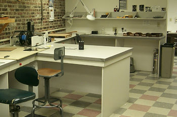 In fact, that reading came from this image, shot with a digital camera in a flourescent lit room. You might look at it and have the distinct impression of “something’s wrong”, but what? We tend to think of flourescent lighting as being deficient in red, leading to green images, but in this case the combination of light and camera is less green than it is yellow. How do we know that? Well, I’ve done you a favor by picking an image with loads of potential neutral reference points. (You can grab a larger version of this image here if you wish to work with it on your own.) We run the cursor around any one of the things that our eyes say probably ought to be neutral, and over and over again the Info Palette announces that blue is seriously low.
Here’s the reference point I chose, and the Info display, followed by the correction applied, followed by the net result:
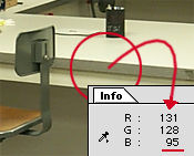
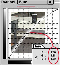
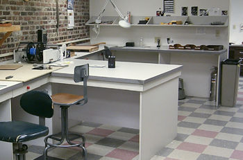
 Locate the source of the problem with the Info Palette. Go straight to the problem channel in the Curves dialog. Make the problem go away. As you move the curser out of the image window into the Curves dialog, the Info paletted display goes away; but if you have made a change to one or more curves, when the cursor goes back into the image window the read–out now displays a “before and after” reading. Wow! And, as we saw in grayscale, a command/control click in the image window plants a point on the curve. In color it gets better: if you have, for instance, the blue channel displayed, that's where the point gets planted. Wow Wow! Simple! Of course not all images are this simple, and even this one could have used other help too, but the point is just look at what a difference pulling one point in one channel made! I could have spent ages having at it area by area, but pulling a global curve based on a known neutral worked wonders. Are you shocked? Are you stunned? Are you ready to go?
![]()
![]() Here’s a super helpful tip Adobe introduced with Photoshop 5. It’s annoying to have to keep making trips back into the image window to check on whether you've brought the color value to where you want it. And it’s hard to get the curser back to the exact same place each time. Hiding under the Eyedropper tool is a locking eyedropper. Click in the image on the point you want as a reference; the little cross hair icon stays there and a new level appears in the Info Palette. Adjusting curves is simple now: the before and after readout is always there to refer to until you dismiss or accept the changes.
Here’s a super helpful tip Adobe introduced with Photoshop 5. It’s annoying to have to keep making trips back into the image window to check on whether you've brought the color value to where you want it. And it’s hard to get the curser back to the exact same place each time. Hiding under the Eyedropper tool is a locking eyedropper. Click in the image on the point you want as a reference; the little cross hair icon stays there and a new level appears in the Info Palette. Adjusting curves is simple now: the before and after readout is always there to refer to until you dismiss or accept the changes.
 The eyedroppers still work, just as they did in grayscale, and now the middle, “neutral” dropper has some meaning. As we discussed before, double clicking on each of the eyedropper icons will open the color picker. This allows you to set exactly how that dropper will function. If you have some specific parameters, this can be very useful. If you need to keep whites no lighter than 250 – 250 – 250 and blacks no darker than 5 – 5 – 5, set up the droppers and that’s what you will get. I still prefer direct manipulation of the curves most times, but the droppers can be handy. I still have same guarded opinion of the Auto button however. A click on this will set the darkest point in each channel to 0 and the lightest to 255. Sometimes it’s great, but often it does violence to both color and contrast. However, if you are stumped by an image, give it a try. The preview will tell you the story pretty quickly; if you hate it, try this trick: hold down the option/alt key and notice that the button which had been “Cancel” changes to “Reset”. Now wasn’t that thoughtful?
Two final points before concluding with some Power User tips. Point One: We have looked so far at doing everything globally (to the whole image at once). But you might see that there are times when it is in fact warranted to use curves on a local selection. There are times when the foreground doesn’t match the background, or the background is too dark but the subject is okay… any number of cases can come to mind. After having done everything possible to the image overall, it’s certainly legal to have at it with selection tools and work locally with Curves! They are just as powerful and capable inside a selection boundary.
Point Two: I have invested many many words describing how to discern and remove a color cast from an image, bringing it to neutral. But not all images want or need to be neutral! There will be times when you will want to enhance a tan, exaggerate a sunset or brighten up a lawn. There will be times when an image needs to be warmed or cooled to work better with other images in a montage. You should have no fear now! Your eyes will have to be your guide since this is interpretation and there are no numerical reference points, but if you had to put a little more red into a face or take some yellow out of moody twilight shot, you know how to approach it now. If at the same time you need to make it darker and less contrasty - one trip to Curves and you can take care of it all!
Power User Tips
Four tips to make your life easier.
- Fade Curves; sometimes you have done the right thing, just a little too heavy handed. Your best friend could be found in, of all the unlikely places, the Edit menu: Edit>Fade Curves. (Just to avoid confusion, version 5.x of Photoshop located this command in the “Filter” menu.) Immediately after clicking “OK” in the Curves dialog, this option becomes available. You can adjust the amount of the effect of the Curve you just applied! Very handy for fine tuning, but like Undo in that it is not available after you do anything else — use immediately in other words!
- Undo and Reapply; Let’s say you just spent 5 minutes tweeking your curves and you were on the right track, but now that you see it you’re not perfectly satisfied. Undo Curves (command/control + z). You know the keyboard shortcut for Curves is command/control + m. If you press command/control + option/alt + m the curves dialog opens with the last settings!!! Now you have the opportunity to rework them a bit without throwing out all the effort you have invested already. As with tip 1, the Undo step of this tip is only available immediately. But the open with previous settings can be invoked any time during a Photoshop session. It remembers the last Curves settings (works with Levels too if you substitute “L”). Let’s say you have 6 images from a shoot all needing the same Curve. Write the Curve for the first one and reapply it effortlessly with the other 5.
- Batch Process; This is an extension of number 2. Frequently you will be shooting a number of shots in a similar location or with similar lighting. Try to get into the habit of shooting the first shot with a neutral reference in it. Since not everybody travels with a gray card, a down–and–dirty trick that can work equally well is to use a sheet of newspaper. No, not US Today’s color front page; something with mostly type, like the Wall Street Journal. Back at your office, color correct to this neutral reference and, before clicking “OK”, click “Save”. Now if you know how to make Actions in Photoshop it’s a cinch to batch process dozens or hundreds of images with this same curve!
- Adjustment Layers; I’ve saved my very favorite till last. Hope you’re still alert and with me! Every new version of Photoshop includes new features, and it seems like every new version makes it easier and easier to use the program in real life. What do I mean? Real life involves clients. It involves vaguaries. It involves interpretation and opinion. Any feature that allows you to change your mind at a later date non–destructively is a feature aimed at real life for professionals. (Every application of Curves or levels or whatever involves some shuffling of data, and this is not lossless; once or twice and you'll never see it, but do it too many times and the image will start to show the wear and tear.) Adjustment layers permit unlimited lossless fiddling!
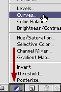 (Please note that the above method for creating an adjustment layer refers to the version 5.x interface. Versions of Photoshop since Six have made it far easier to create adjustment layers, and have added even more options. They are most conveniently accessed from a pop–up menu at the bottom of the Layers Palette. Press the Adjustment Layer icon and select the type you wish from the menu that appears.)
![]()
![]() You know how to create a new layer, by clicking the New Layer icon at the bottom of the Layers palette. Try this: hold down command/control while clicking. It’s a special type of layer, called an Adjustment Layer. You can select from the pop up menu whether to have it be a Curves layer or Levels, or Hue/Saturation or several others. Select Curves, and the Curves dialog immediately appears. What’s different now is that, instead of directly acting on the pixels in a layer, this adjustment layer sort of “describes” the curve to any layer below it. Nothing actually happens to a pixel until or unless you flatten the image; up until that point Photoshop knows to display the effect of the curve but not actually do it for real.
You know how to create a new layer, by clicking the New Layer icon at the bottom of the Layers palette. Try this: hold down command/control while clicking. It’s a special type of layer, called an Adjustment Layer. You can select from the pop up menu whether to have it be a Curves layer or Levels, or Hue/Saturation or several others. Select Curves, and the Curves dialog immediately appears. What’s different now is that, instead of directly acting on the pixels in a layer, this adjustment layer sort of “describes” the curve to any layer below it. Nothing actually happens to a pixel until or unless you flatten the image; up until that point Photoshop knows to display the effect of the curve but not actually do it for real.
![]() So there it sits in the layer stack - pure magic. Not happy with the curve? Double click the little black/white icon and the Curves dialog opens with the previous settings, ready to be tweeked. This is similar to tip 2, Undo and Reapply, but you can come back and do it any time, hours, days, weeks later, so long as you save the layered Photoshop file (naturally you lose this tool when you save in any format other than PSD). Don’t forget this tip! The more you work with Curves, the more likely it is to save your butt, especially with demanding clients. I tell you from personal experience, you only have to pull out this trick once on an 18 layer, 40 megabyte magazine cover image to want to kiss some programmer at Adobe!
So there it sits in the layer stack - pure magic. Not happy with the curve? Double click the little black/white icon and the Curves dialog opens with the previous settings, ready to be tweeked. This is similar to tip 2, Undo and Reapply, but you can come back and do it any time, hours, days, weeks later, so long as you save the layered Photoshop file (naturally you lose this tool when you save in any format other than PSD). Don’t forget this tip! The more you work with Curves, the more likely it is to save your butt, especially with demanding clients. I tell you from personal experience, you only have to pull out this trick once on an 18 layer, 40 megabyte magazine cover image to want to kiss some programmer at Adobe!
Special Effects
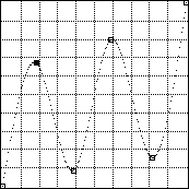
You have seen the power of the Curves command; you have seen how a pixel’s tonal values can be mapped to a different tone. You have seen what an impact a relatively mild curve can produce. You have seen Curves used for boring, utilitarian, everyday pay the bills purposes. I said at the beginning of this piece that Special Effects were beyond the scope of what I would cover, and it is. But just to give you a taste of how dramatic Curves can be used to produce remarkable synthetic effects, take a look at this sequence, starting with a plain black–on–white graphic. The graphic is blurred, to give some gray tones for curves to remap. After the tonal distortion, the original graphic is used to trim the new one, and a fairly conventional color effect is provided by Hue/Saturation. Do you sense the possibilities?




Recommended Reading
I have only touched on RGB images; CMYK is beyond the scope of this essay. The grand Guru for all things CMYK is Dan Margulis. His landmark book Professional Photoshop (check Amazon or your local book store for the current edition) should be on the required reading list of anyone preparing files for 4–color printing. His coverage of curves and printing issues is exhaustive, innovative and fun to read too! Other outstanding resources on my bookshelf include Real World Photoshop by Bruce Fraser and David Blatner, Photoshop 5 Artistry by Haynes and Crumpler and the Photoshop Bible series by the fabulous Deke McClelland. (Oh yeah - you might consider reading the manual too - the Adobe folks really do an excellent job with documentation on a program this massive!).
There is still so much to say, but now you have the framework to be able to master Curves, the most powerful tool for professional image editing. Time to jump in and make your own photos better!